You can increase your response to your marketing if your copy is:
- Powerful direct response copy.
And
- Easy to read.
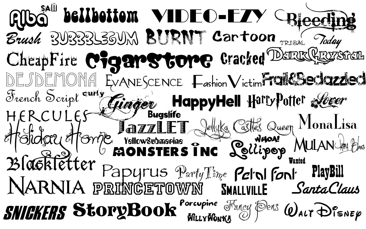
To make it easy to read, you have to use the right font.
It’s a simple thing, but you’d be surprised by how often it’s overlooked! I just did a critique for a website and one of the first things I noticed was that the fonts were hard to read.
Different situations and different media call for different fonts. A print magalog requires a different font than an email message.
Generally, I use this simple guide: Use a serif font for print and a sans serif for online.
Personally, for printed materials, I use Times New Roman, and for online materials like the article your reading now, I use Arial.
If you’d like to find out more about optimizing your response, give me ca all at 310-212-5727 or send me an email at [email protected].
