“Pop-ups” have a bad name.
And a traditional “pop-up” is easily blocked by a pop-up blocker…
For every campaign I create, I use a “floater.”
A floater looks like a pop-up. Feels like a pop-up. But it’s not.
Should you use floaters on your website or landing page?
Here is one thing I have learned in using floaters for over 15 years:
If you are selling your services online…then you should be using floaters.
If you have a landing page where you are asking visitors to respond to any type of offer…then you should be using floaters.
If you run an e-commerce site and sell a product….then you should be using floaters.
What is a floater?
A floater is a marketing tool that sends a form that “floats up” over a website or landing page.
Typically, the form is used for data collection. It can also show a special offer or discount (which later links to data collection).
Usually, I’ll use it to collect a name and email address by offering a free special report.
The floater form asks a user to enter in their contact information: name, email, and sometimes phone number or address.
Floaters are powerful, because they help you collect a highly responsive database to convert visitors into leads and sales.
Without a floater, you’ll lose out on engaging with your prospects.
By generating floater leads, you develop a database that is far more likely to buy from you.
Leads receive your emails, see your digital ads and receive your direct mail, and they are very likely to become customers…loyal customers that purchase from you again and again.
Floaters enable you to collect valuable data, to expand your prospect base and to build powerful custom lists that will help you to multiply your profits and grow your business.
This is not an optional marketing tool—floaters are key to your success.
How to Use Floaters
It’s critical that you know how to use floaters.
At their worst, they are annoying obstacles to a visitor. At their best, they are powerful marketing tools that serve you and your prospective customers.
Here are 5 secrets to creating floaters that will expand your customer base and multiply your profits:
1. Create a powerful offer for prospects.
A special discount offered for first-time website visitors is a powerful incentive for prospects to enter their information.
Plus, prospects will be thrilled to be offered a “surprise” special discount.
Offer 10-15% off a first-time purchase, and you’ll collect the name and information of your site visitor…and sell them a product.
Contest entry is another way to motivate prospects to fill out floater forms.
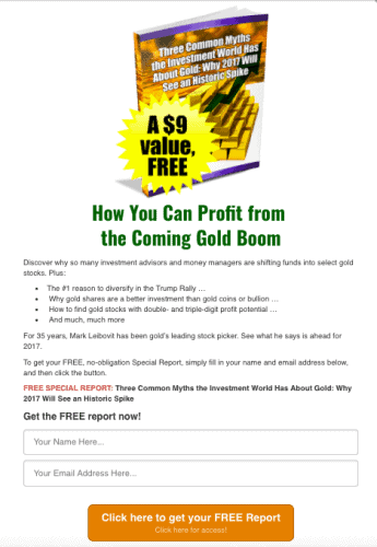
Take a look at this floater I created for one client, which offers a free special report for new subscribers:
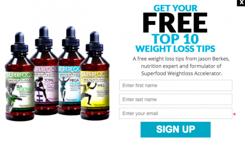
Or, I created a floater with a free guide on weight loss tips for an alternative health client:
Other types of offers can include: free shipping, a value-added piece such as a free e-book or download, or special information about items on sale.
2. Floaters can appear in different formats, shapes and sizes.
Floaters can come in different shapes and sizes. They are typically square, but they can also be circular, or even cover the entire page, called a “welcome mat.”
I recommend testing different formats to see which ones get the highest response on your website.
Floaters can even appear semi-transparent so that visitors can still see the website or landing page behind the floater. This is one way to keep prospects from feeling confused or like they are not on the page that they clicked on.
3. Try a “slide in” floater.
Floater forms do not need to cover the page or appear at the center of a site. They can also “slide in” at the side or bottom corner of your website or landing page to be less obtrusive.
The flip side of this strategy is that they may produce less sign-ups.
As always, test for what works best for your audience.
4. Testing and analyzing results are critical to your success.
Always test your floaters.
You may be able to dramatically increase response by changing some of the variables.
Here is a test that we performed on floaters for our own CDMG homepage:
Version A:
Version B:
Which version do you think performed better?
A simple change in text color and highlight color produced an incredible difference in response.
Version B outperformed by more than 500%, with a 1.3% conversion rate, compared to a 0.19% conversion rate.
Version B received 158 new subscribers. Version A received two new subscribers.
This is an example of a small change that can have a big impact.
So, make sure to test your floater buttons to improve your response rate—and number of valuable new subscribers.
5. Test for trigger points.
Timing of a floater can significantly affect your response rate.
I usually have it appear after 10 seconds.
Do you want the floater to immediately appear when someone visits your web page, or should there be a delay?
Or, should the floater appear when a visitor is about to leave a page—or when a visitor scrolls down the page?
There are a number of triggers that you can customize for your floater.
Like any of the other factors, it’s critical that you test these variables.
I recommend “entry” and “exit” floaters. Entry floaters are great to encourage visitors to make a purchase, especially when the floater includes a discount or special offer. Exit floaters are great for motivating people who are about to leave your webpage to stay.
Consider the timing of your floater before choosing your format…the placement and timing will affect what kind of design will be best for your floater.
If you would like to discuss your digital marketing strategy or adding floater buttons to your site, give me a call at (310) 212-5727 or email Caleb at [email protected].
Here are the rest of this week’s articles:
- 13 Key Strategies to Creating an Effective, Integrated Multichannel Campaign
- Copy tip: Don’t go overboard!
- Testing corner: Can simple changes have a big impact?


